|
|
|
|
|
|
|
|
- Overview of the Sliding Banner control
- Creating a Sliding Banner control
- Characteristics of the Sliding Banner control
- Description window
- Content of planes used for the Sliding Banner control
- Customizing the Sliding Banner control
The Sliding Banner control
 Warning Warning
From version 24, Scrolling Banner is kept for backward compatibility. This function has been replaced with The Sliding Banner control.
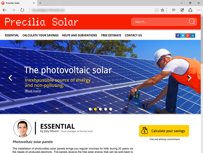
Overview of the Sliding Banner control The Sliding Banner control is used to display several contents successively, either automatically, or further to an action performed by the Web user. It is not just an automatic slide Image control or a linear looper! The Sliding Banner control can contain controls and processes. The Sliding Banner control is used to display independent contents in different slides. Sliding Banners are often used as site headers. Example:
 
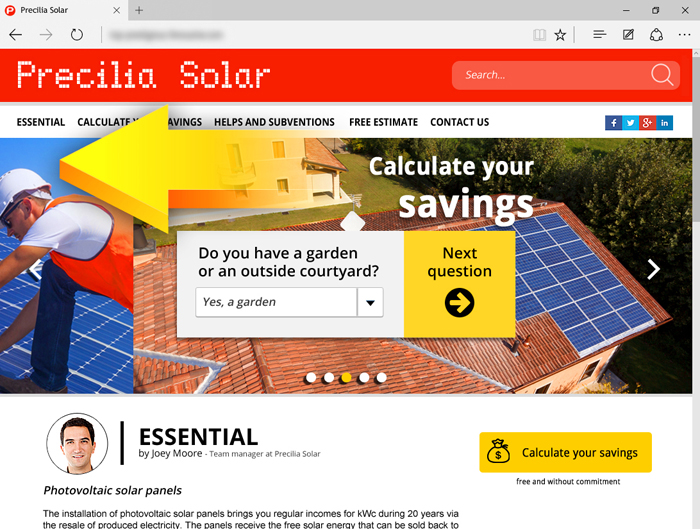
The slides of a Sliding Banner change automatically or when requested. The slides can contain controls.Creating a Sliding Banner control To create a Sliding Banner control: - On the "Creation" tab, in the "Containers" group, click "Sliding Banner".
- Click where you want to create the control in the page. The control appears in the editor.
- The Sliding Banner control includes:
- several planes with the different elements of the sliding banner. Each plane contains all the controls required by a "slide" of the Sliding Banner.
- slider bullets (or indicators), displayed at the bottom of the sliding banner, allowing the user to access a slide directly.
- slide buttons, allowing the user to cycle through the "slides" of the Sliding Banner.
The created control contains 3 planes by default. The first plane is displayed in the editor. You can directly create the controls that will be displayed in the different planes.
Remark: To access the different planes in the editor, you must: - select the Sliding Banner control.
- use the Page Up/Page Down keys to move between planes.
To view the characteristics of the control, select "Description" in the context menu. Remark: The Sliding Banner control is WYSIWYG in the editor: - If you click the left button and the right button in the editor, the corresponding planes will be displayed.
- If you click the slider bullets (or indicators) in the editor, the corresponding planes will be displayed.
Characteristics of the Sliding Banner control Description window The description window of the "Sliding Banner" control is used to: - Create or delete the planes corresponding to the different "slides" of the sliding banner ("General" tab). Three planes are available by default.
Remark: To access the different planes in the editor, you must: - select the Sliding Banner control.
- use the Page Up/Page Down keys to move between planes.
- Define the properties specific to a plane ("General" tab): Simply select the desired plane to define:
- whether the plane is visible by default.
- the style options for the plane.
- the plane tooltip.
- Define the operating options for the Sliding Banner control ("Details" tab): The options are as follows:
- Define how the user will enable the slides. The available modes are:
- with the keyboard: the user can click the arrow buttons to cycle through slides.
- by horizontal swipe: the user will have to swipe with the mouse to cycle though slides.
- by touch 'scroll': the user will have to perform a touch swipe to cycle through slides.
- with slider bullets: the user will have to click the bullets to cycle through slides. If this option is not checked, the bullets are not displayed in the sliding banner.
- with a previous button: the user will have to click the previous button of the sliding banner to cycle through slides. If this option is not checked, the previous button is not displayed in the sliding banner.
- with a next button: the user will have to click the next button of the sliding banner to cycle through slides. If this option is not checked, the next button is not displayed in the sliding banner.
- Enable click in banner background. Used to manage the click on the sliding banner background. If this option is checked, the "Click" event is automatically added to the events in the Sliding Banner control.
- Start sequence automatically: Enables the automatic slide. In this case, all the visible planes are automatically displayed according to the order of planes and with the specified display duration.
- Stop slide on hover: Stops cycling through planes when hovering over the current plane.
- Duration of each slide: Duration between each "slide" of the Sliding Banner.
- Define the style for the Sliding Banner control ("Style" tab): You can define:
- the CSS options of the control.
- the slider bullets (indicators):
- CSS style, if necessary.
- Image set. The image set used must be compatible with the image set used for the Radio Button and Check Box controls. This image set can also contain an animation for the bullets.
- Bottom margin: distance of bullets in relation to the bottom border of the Sliding Banner control.
- Spacing between each element: spacing between bullets.
- Width and height of elements.
- the button on the left:
- CSS style, if necessary.
- Image set. The image set used must be compatible with the image set used for the Button controls. This image set can also contain an animation.
- Offset to left: distance between the button and the left border of the control.
- Width and height of button.
- the button on the right:
- CSS style, if necessary.
- Image set. The image set used must be compatible with the image set used for the Button controls. This image set can also contain an animation.
- Offset to right: distance between the button and the right border of the control.
- Width and height of button.
Content of planes used for the Sliding Banner control - The planes associated with the Sliding Banner control can contain all the types of controls found in WEBDEV except another Sliding Banner control.
- A control in one plane of the banner can be associated to several planes of the Sliding Banner control. In this case, the control automatically becomes overlayable.
Customizing the Sliding Banner control By default, the Sliding Banner control features buttons and slider bullets to cycle through planes. These elements can be customized in the control style. If you do not want to use the controls proposed by default, you can use specific controls positioned outside the Sliding Banner control. Then, all you have to do is: - configure the Sliding Banner control to no longer use the default controls ("Details" tab of the control description).
- program the action of the new controls with the slide management functions. For more details, see Customizing transitions between slides.
Related Examples:

|
Complete examples (WEBDEV): WW_Rewali
[ + ] This example is a site for travel booking. It proposes travels at very attractive prices. You have the ability to choose the travel duration, the start dates, then validate the purchase until the payment via Paypal. It is using the "scrolling banner" control and the planes.
|
|
|
|
|
|
|
|
|
|
|
|
|
|
|
|
|
|
|
|
|