|
|
|
|
|
|
|
|
- Lesson 1 - Simple layouts
- What does "mobile-friendly" mean?
- Concepts in WEBDEV
- Using layouts
- Simple layouts
- Page used
- Creating a Mobile layout
- Defining the Mobile layout
- Page test
- Layouts and specific controls
- Page used
- Creating a Mobile layout
- Defining the Mobile layout
- How to adapt the size of a Looper control?
- Testing the page and the project
- To sum up
Tutorial - WEBDEV layouts
Lesson 1 - Simple layouts We will cover the following topics: - What does "mobile-friendly" mean?
- Creating a layout.
- Dissociating the positioning of controls.
- Manipulating Looper controls.
 30 min What does "mobile-friendly" mean? More and more people are using their phones or tablets to access Internet and Intranet sites. This means that sites must be designed in a way so that they adapt easily to mobile devices (phones or tablets). In a mobile-friendly site, users should be able to access all the main information of the website from their devices, without having to zoom or reduce the pages. Concepts in WEBDEV WEBDEV includes various methods to make sites mobile-friendly: - Dynamic Serving: "Dynamic serving" is a technique where the same address (URL) leads to 2 different pages: a page for PC and a page for mobile. The page will be displayed based on the device (PC or mobile) that opens it.
With "Dynamic serving", you no longer need to modify the existing pages: simply add mobile-specific pages.
However, this method requires using two sets of pages, and therefore two sets of code to be executed. - Legacy Responsive Web Design: With this method, pages are divided into resolution ranges (slices) that adapt the website to mobile devices. This solution allows you to use the same code regardless of the target device. However, this edit mode requires great attention to detail.
- Layouts. We have already mentioned and explained this method in different parts of this tutorial. By using layouts, you can quickly implement a specific interface for mobile devices. The code remains the same. Simply move, hide or configure the different controls in the mobile layout. The WYSIWYG page editor shows your changes immediately.
In this tutorial, we will see the different techniques you can use to easily create layouts in your pages. More specifically, this lesson will allow us to: - dissociate the positioning of controls.
- position controls in the different layouts.
- set the visibility of controls in each layout.
- manipulate Looper controls in layouts.
The next lesson will cover how to use a menu in a layout. To discover the tools available in WEBDEV to create web sites using layouts, we will handle an example project. This will allow you to perform each operation and better understand the available tools. Opening the example project - Go to the WEBDEV home page (Ctrl + <).
- On the home page, click "Tutorial", then in "Tutorial - WEBDEV layouts", double-click "Layouts - Exercise".
 Warning Warning
This project will be used in the different lessons of this tutorial.
Page used To understand how to set the order of the controls, open "PAGE_ControlOrder" in the WW_Layout project.
This page contains: - a Static control with a title.
- 3 Image controls and 3 Rich Text Area controls laid out horizontally. The Rich Text Area controls show the captions of the images.
Let's see how the page is resized when the browser is resized. - Test the page (click
 in the quick access buttons). in the quick access buttons). - The page is displayed in the browser.
- Resize the browser: the site is not displayed correctly.
- Close the browser.
This is not the expected behavior
In mobile mode, we want to display the 3 products and their captions in a vertical layout, and occupy all the vertical space available in the page. Creating a Mobile layout Let's first create a new mobile layout: - On the "Page" tab, in the "Layouts" group, expand "Layouts" and select "Add a layout".
- In the window that appears, a layout adapted to phones and tablets is shown.
Confirm.
- Two layouts have been created in our example. These layouts are displayed as thumbnails, to the right of the "PAGE_ControlOrder" page. The mobile layout is automatically selected and displayed in the editor.
The areas highlighted with a red dotted line indicate there is a conflict.
Defining the Mobile layout To define our layout, let's start by enlarging the page vertically: - Click inside the rectangle that represents the page. The status bar indicates the page size: 320 x 406.
- Change the page height from 406 to 1200.
Next, let's reposition the controls in the page. - Select the "Dissociate positioning of controls" title and adjust it horizontally to match the width of the page.
 The 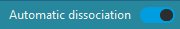 option (upper-right corner of the main window, in the title bar) allows you to enable or disable the "Automatic dissociation" mode. With this mode (default), when a control is moved or resized in one of the pages in the layout, the changes will not be applied in the other pages. - Select the second image and its caption, and move them below the caption of the first image.
- Repeat these steps for the third image.
- Select the three images and their captions, then go to the "Alignment" tab, "Centering and distribution" group, and select "Center in the parent".
Now, let's focus on the title: the text is too large and does not fit completely in the control. We will therefore decrease the font size, but only in the mobile layout. - If necessary, open the mobile layout (double-click the corresponding thumbnail).
- Select the title and open the control description window (Alt + Enter).
- In the "Style" tab, change the size from 24 to 20 pixels.
- Validate. The text now fits in the Static control.
- Save the page (Ctrl + S).
Since the "Automatic dissociation" mode is enabled, the font size has been modified only in the current layout. This can be easily checked: - Open the Desktop layout: double-click the "Desktop" thumbnail to the right of the page.
- Open the Static control description window: in the "Style" tab, the font size is still 24 pixels.
Page test Test the page (click in the quick access buttons). - The page is displayed in the browser.
- Resize the browser: the mobile layout is displayed.
- Close the browser.
Now, we can test the website on a phone or a tablet: - Expand the option in the quick access area and select "Test from a phone (access via a QR Code)".
- A window appears and shows a QR code that you can scan with your mobile device.
- Once you scan the QR code, the website is displayed on the device.
- The "Mobile" layout is automatically displayed.
Layouts and specific controls Page used Open the PAGE_Adaptations page.
This page contains different controls: - a title at the top,
- a Map control to indicate the restaurant location,
- a Rich Text Area control containing the address of the restaurant,
- an Image control on the right to display an advertising banner,
- a Looper control at the bottom to display the opinions.
Let's see how the page is resized when the browser is resized. - Test the page (click in the quick access buttons).
- The page is displayed in the browser as it was in the editor in Desktop mode.
Warning
This page uses a Map control. In test mode as in production, it is necessary to use a Google key. Otherwise, an error occurs in the Map control. See the online help to get this key. If you already have a key, specify it in the "Project" tab of the project description window.
- Reduce your browser to see how the page would be displayed on mobile devices.
This is not the expected behavior. In the mobile layout: - the ad image should not appear,
- the map should be smaller and appear under the description.
- the Looper control should display the information on a single column.
Creating a Mobile layout Let's first create a new mobile layout: - On the "Page" tab, in the "Layouts" group, expand "Layouts" and select "Add a layout".
- In the window that appears, a layout adapted to phones and tablets is shown. Validate the window.
- Two layouts have been created in our example. These layouts are displayed as thumbnails, to the right of the "PAGE_Adaptations" page.
The mobile layout is automatically selected and displayed in the page.
Defining the Mobile layout To define our layout, we will enlarge the page vertically: - Click inside the rectangle that represents the page. The status bar indicates the page size: 320 x 616.
- Change the page height from 616 to 1024.
We will also change the page margins in mobile layout mode. The margins of the "Desktop" version of the page have been preserved, but they are too large for the mobile version. To reduce the margins: - Open the page description window: on the "Page" tab, in the "Description" group, click "Description".
- In the "Style" tab, expand "Element" and select "Margins".
- Replace "20px" with "10px".
- Validate.
To better understand these changes, move the different controls to the area to the right of the page. For each control (except the title): - Select the desired control.
- Move the control to the area to the right of the page.
Some areas may be highlighted in red, indicating that there are positioning conflicts. This behavior is expected. We will now adapt the controls one by one. To adjust the position and/or size of simple controls (Static, Edit, Image, Map, etc.), simply make the desired changes in the editor and they will be applied only in the current layout. This is made possible by the automatic dissociation we saw previously in this lesson. The Image control should not appear on mobile devices. Therefore, we will make it invisible in the mobile layout: - Select the Image control.
- In the context menu of the control, select "Layouts", go to "Visibility by layout" and deselect "Mobile (Smartphone)".
- The control disappears from the mobile layout.
Remark: The visibility of a control is defined in the "UI" tab of the control description window.
Now, let's move the different controls to position them in the page: - Place the text area below the title, and resize it so that it fits in the page.
- Likewise, place the Map control below the text and resize the control.
- Then, resize and place the "Reviews" control. You will get the following interface:
- Lastly, place the Looper control.
This control is too large for the Mobile layout. We will see how to adjust the size of this control according to the different layouts.
How to adapt the size of a Looper control? The Looper control should be displayed differently depending on the layout. In this case, it should have two columns in the Desktop layout, but only one in the Mobile Layout. To do this, it is necessary to "dissociate" the number of columns displayed by the control in each layout. To dissociate the number of columns displayed by the Looper control: - Select the control in the Mobile layout.
- Open the control description window.
- In the "Details" tab, click
 . In the window that appears: . In the window that appears: - Check "Dissociate value per layout".
- For the Desktop layout, keep "2".
- For the mobile layout, replace "2" with "1".
- Validate.
- Validate the control description window.
- The Looper control shows only one column in the mobile layout. You can resize it so that it fits entirely in the page.
Save the page (Ctrl + S). Testing the page and the project Test the page (click in the quick access buttons). - The page is displayed in the browser.
- Resize the browser: the mobile layout is displayed.
Close the browser. Now, we can test the website on a phone or a tablet: - Expand the option in the quick access area and select "Test from a phone (access via a QR Code)".
- A window appears and shows a QR code that you can scan with your mobile device.
- Once you scan the QR code, the website is displayed on the device.
- The "Mobile" layout is automatically displayed.
In this lesson, we created and manipulated layouts to create relatively simple pages. In the next lesson, we will create a menu in a page that uses a layout. Completed project:
If you want to check the end result of the steps described here, you can open a completed version of the project. In this project, all the actions described in this lesson have already been completed. To open the completed project, go to the home page and click "Tutorial", then in "Tutorial - WEBDEV layouts", double-click "Layouts - Answers". |
|
|
|
|
|
|
|
|
|
|
|
|
|
|
|
|
|
|
|